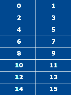
The dashboard display is divided into 16 slots numbered from
0 to 15. Each slot is 120 pixels wide by 40 pixels high.
Widget slots
A complete layout assigns a widget to each of these slots.
Widgets can occupy more than one slot, and each has a number of
options to control its appearance and behaviour. This page describes
all available widgets and their options.
Widgets are specified in the show area of the
PAGE definition. Each starts with the slot number followed by the
widget type followed by the options inside curly braces. See examples
below.
Notes
options that you must specify are shown in red, options that really are optional are shown in
blue
all options are used as opt=val pairs within the
widget's curly braces.
line breaks are flexible, but must not occur within a single
option. This is particularly important for the GUIDEGRID ranges.
double quotes are generally only needed if a value contains a
space. This might be to right-justify a label, or the multiple
numbers in a GUIDEGRID range.
if you're perverse enough to want a double quote in a label a
backslash inside the quotes will work for just this one character.
For example label="\"Q\"" will yield the label
"Q".
.
BLANK
The BLANK widget occupies one slot. It has no effect on graphics
or polling. It just uses up the slot which is then available
to display a logo or graphical output from a BOOLEAN widget.
Unconfigured slots will be automatically assigned plain BLANK widgets.
options
float (0 to 99, 0) allows the TEXT or SEG7 widget on the right to
"float" leftwards on the screen using up the given percentage of this
widget's slot width. In implementation it only floats in steps of 25%
of a field width so the useful values are 25,
50 and 75.
BOOLEAN
The BOOLEAN widget occupies one slot. It operates as an on/off
alert. Like the blank widget, the BOOLEAN has no built-in graphics.
However it can run display lists for on and off events
which, in a way, makes this the most flexible of all the widgets.
options
var (handle) polled value to be tested.
mask (integer) this number is binary ANDed
with the polled value and if the result is non-zero it is considered
true.
ifhigh (display list name) display list to
run under one of two circumstances:
On a low/high transition.
On every transition if there is no iflow action. In this
case the foreground pen will be set to the selected colour on
low/high transition and to colour 0 on
high/low transition.
The context for the display list will have its origin set to the
coordinates of the top left of the widget slot. If output is to go
elsewhere on the screen, the display list should start with an
ABS instruction.
iflow (display list name, 'none') display list
which will be run on a high/low transition. The
foreground pen will be set to the selected colour.
fg (integer in [1:4],
1) colour to be selected prior to running
display lists. Refers to the base colour map.
float (0 to 99, 0) allows the TEXT or SEG7 widget on the right to
"float" leftwards on the screen using up the given percentage of this
widget's slot width. In implementation it only floats in steps of 25%
of a field width so the useful values are 25,
50 and 75.
egval (integer, 0) test value to be used for
preview image.
example
Highlight a symbol when warmup enrichment is active.
This will execute the therm display list when the warmup
enrichment indicator bit changes (see comments in the Megasquirt .INI
file). The foreground colour will be set to 2 (default red) when
warmup is on, and to 0 (default black) when warmup goes off.
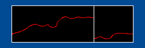
CARDIO
The CARDIO widget occupies both columns in two rows. It displays a
graph of up to two values read from the Megasquirt. These values have
independent Y axis scales. The vertical line indicates the current
update point and, like a cardiogram, will wrap to the left border when
it passes the right one.
The display shows 200 values: enough for 12.5 seconds of history
for a last poll (i.e. 16x per second) and typically about 6
minutes for a mean poll.
options
avar (handle) variable A. Each time the
variable is updated, the value is scaled and plotted in colour 2.
amin (number) value of variable A
corresponding with the bottom pixel of the window. Values that scale
below this will be plotted at the bottom.
amax (number) value of variable A
corresponding with the top pixel of the window. Values that scale
above this will be plotted at the top.
cmap (colour ref,
0) background
will be drawn in colour 0, border and update line in colour 1, A-value
in colour 2, and B-value in colour 3. In the default colour
table these map to black, white, red and yellow respectively.
bvar (handle,
none) variable B.
As for avar. Must update at the same rate as
avar (i.e.
both or neither must be last sampled). Plotted in colour 3.
bmin (number, 0)
like amin.
bmax (number, 100)
like amax.
egaval (number, 0) test value for
variable A in preview image.
egbval (number, 0) test value for
variable B in preview image.
example
To display coolant temperature, say to get an idea of warmup rate.
4 CARDIO {avar=CLT amin=20 amax=100 egaval=85}
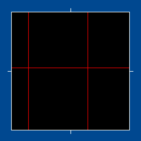
GUIDEGRID
The GUIDEGRID widget occupies both columns in six rows. It
is configured with X and Y grid values (typically RPM and MAP
bins). These values are shown in the window as vertical and
horizontal lines with the centre of the window being the current
values of the two variables.
To minimise flicker, a maximum of two lines will be drawn
horizontally, and two vertically. With a reasonably regular grid, the
configuration program will make one or two visible lines the usual
case. If your grid is very irregular the display may end up being
confusing.
options
xvar (handle) as this polled value
changes, the vertical grid lines will move left or right.
yvar (handle) as this polled value
changes, the horizontal grid lines will more up or down.
xrange (list of numbers) these are
"landmarks" to be drawn as vertical lines. The whole list of numbers
must be enclosed in double quotes and separated by spaces. There is a
limit of 16 numbers per list. Unfortunately programmer laziness means
the entire list must be on the one line.
yrange (list of numbers) these are
"landmarks" to be drawn as horizontal lines, with the same rules
applying as for xrange.
cmap (colour ref, 0) window
background is drawn in colour 0, border and centre graticules are drawn
in colour 1, moving grid lines are drawn in colour 2.
egxval (number, 0) test value
for xvar in preview image.
egyval (number, 0) test value
for yvar in preview image.
example
Typical use for guiding autotuning at grid intersections:
This widget occupies slots 2 to 13 leaving 0, 1, 14 and 15 for
other uses. Note that idle and low load areas have been left off
the grid since it doesn't make much sense to autotune those areas.
LEDBAR
The LEDBAR widget occupies both columns in one row. It is
a linear scale with the leftmost LED coming on when a low value is
passed and the rightmost coming on when a high value is passed.
There are always ten LEDs and they can be split into up to four
blocks of colours.
options
var (handle) as this polled value
updates, more or fewer of the LEDs will be lit.
low (number) polled values below this
number will leave all LEDs dim. The leftmost LED will light as soon
as the value reaches this number.
high (number) polled values at or above
this number will show all LEDs bright. The rightmost LED will light
as soon as the value reaches this number.
n1 n2 n3 n4 (integers in [0:10]) the
number of LEDs to be rendered in each of up to four colours.
These numbers must sum to 10.
cmap (colour ref, 0) background
is drawn in colour 0 and each of the ranges in colours 1 to 4. Dim
LEDs are at 1/4 brightness.
egval (number, 0) test value for
var in preview image.
Because it's a linear scale you can nail down exactly when two of
the LEDs come on, but it doesn't have to be the first and last. If you
wanted the 3rd LED to come on at 3000 rpm and the 8th at 6000 rpm,
that's (6000−3000 rpm) / (8−3) LEDs or 600 rpm / LED. You'll get what you
want if you configure the first to come on at 3000−1200 rpm=1800 rpm
and the last to come on at 6000+1200 rpm=7200 rpm.
example
A double-row LEDBAR for higher resolution near the redline:
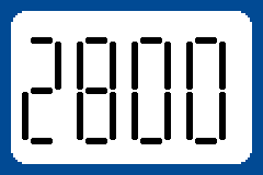
The SEG7 widget occupies one column over two rows. It displays a
polled value in a simulated 7-segment display. The large digits are
easy to read and the widget can be configured to change colour when
thresholds are passed.
options
var (handle) polled value to be displayed.
label (up to 3 characters of text,
"") label for the field. The label overlaps the first of
the four digits and isn't ideal for large numbers like RPM.
bg (integer in [1:4],
1) only used when low and high
thresholds are inactive. Selects a colour in cmap
to be used.
cmap (colour ref, 0) background
is drawn in selected colour (whether by bg option or due
to threshold change), segments in colour 0.
inv (0 or 1, 0) if
1, swaps
foreground and background colour roles, i.e. that background will be
in colour 0 and segments in selected colour.
low (number, 65535 — inactive)
if not inactive and the sampled value is below this number, selected
colour will be 1 otherwise selected colour defaults to 2.
high (number, 65535
— inactive) if not inactive and sampled value is above this number,
selected colour will be 3.
egval (number, 0) test value for
var in preview image.
Note that the colour map can need five entries to support the
bg option, but only needs four if thresholds are being
used.
example
A SEG7 widget showing AFR and occupying slots 1 and 3. The
orange-green-orange colour map means Segments will be green on black
unless the AFR is below 12.5 or above 16.0 in which case the display
will be orange segments on a black background.
The TEXT widget occupies one slot. It displays a polled value
as a number.
options
var (handle) polled value to be displayed.
label (up to 3 characters of text,
"") label for the field. Displayed to the left in a tiny
font.
bg (integer in [1:4],
1) selects
a colour in the base colourmap for display.
inv (0 or 1, 0) if 0, text is
colour 0 with the selected colour as background. If 1, the background
is colour 0 with the text drawn in the selected colour.
egval (number, 0) test value for
var in preview image.
example
Show the TPS value in slot 15. With the default colour table it
will display as black text on a yellow background.
15 TEXT { var=TPS label=TPS bg=3 }
TRILED
The TRILED widget occupies both columns in one row. It combines
a TEXT widget on the left with three LEDs on the right. Only one LED
is lit at a time. Typically the centre LED is the ideal range (for things
like temperature or voltage) and a quick glance tells you if
everything is in a good place.
options
var (handle) polled value to be displayed.
cmap (colour ref) only used for the
three LEDs. Background drawn in colour 0, left, middle, right LEDs
drawn in colours 1, 2, 3 respectively.
low (number) threshold below which the
left LED is on.
high (number) threshold above which the
right LED is on.
label (up to 3 characters of text,
"") label for the TEXT part of the widget. Displayed to the
left in a tiny font.
bg (integer in [1:4],
1) selects
a colour in the base colourmap for the TEXT part of the widget.
inv (0 or 1, 0) if 0, text is
colour 0 with the selected colour as background. If 1, the background
is colour 0 with the text drawn in the selected colour.
egval (number, 0) test value for
var in preview image.
example
Display battery voltage with the the LEDs indicating low or high
voltage problems using slots 12 and 13. With the default colour
table the text will be light blue on a black background.